Drugs are bad, but only if the chi-square analysis works out

Ben Goldacre's piece on the new Lancet marijuana-and-mental-illness meta-analysis (previously mentioned on his site here), and the typically inept media attention it's attracted, is worth reading just for the headline.

I belive "Blah blah cannabis blah blah blah" was actually one of Cypress Hill's later albums.

#000000 - for the environment!

A reader pointed out the questionably power-saving Blackle to me a couple of days ago; now it's hit Slashdot.

In brief: Yes, a CRT monitor uses more power when it's displaying light colours than when it's displaying dark ones. But no, there isn't likely to be any significant difference if your computer has an LCD screen.

A bit of searching (with evil white-screened Google...) turned up this page on the blog of one Mark Ontkush, who started the whole thing.

A reader of the first-mentioned post reports he actually tested a 19 inch CRT and LCD, and found, as you'd expect, that the LCD used less power in the first place but changed its power consumption not at all with the content of the image, while the CRT dropped from 83 watts to 60.

It's conceivable that an LCD might consume slightly different amounts of power when displaying different images, since it takes power to turn on all of those zillions of thin film transistors, three per pixel, that make up the image.

It might even use less power for darker images. I used to be under the impression that when an LCD pixel was fully "on" it was black, but that actually only applies to the old twisted nematic kind of LCD. Most LCD screens these days use newer flavours of LCD technology in which a fully energised pixel is white.

Ontkush's site also has this page, in in which a low-brightness design palette is put forward for much the same reason, and in which a (different) reader finds that the darker colours do indeed seem to reduce an LCD's power draw... by a lousy three watts.

There are some cleverer flat panels these days that modulate their backlight brightness according to the image being displayed. I don't know whether any computer monitors do it (I think it's still a home theatre thing), but it makes sense, and would cause darker images to consume less power.

Most LCDs these days have such super-bright backlights that to use them in most indoor domestic situations you should turn the brightness down to minimum manually anyway. Variable-brightness backlights probably won't be able to go any dimmer than that minimum manual brightness. LED-backlit LCDs (which are still very rare) may be able to go further, though; the minimum brightness at which a cold-cathode lamp will continue to work properly is quite a bit higher than the minimum brightness for a bank of LEDs.

The reader who brought Blackle to my attention had it brought to his attention by that internationally recognised bringer of totally reliable information, a multiply-forwarded e-mail. That particular e-mail, or one very like it, can be found all over the Web now, including the allegation that "Google created a black version of its search engine...".

Blackle is not, of course, actually a Google project. The domain's registered to some outfit here in Australia.

I've never been able to figure out how it is that these sorts of aimless fabrications get tacked onto much-forwarded messages. Somebody somewhere along the line had to make up the "Google created" factoid all by himself and add it to the text... but why?

Snopes is full of stuff like this. Sometimes it's obviously someone just making up a story to go with a funny picture because it entertains them to start a hoax or they want to reverse the political slant of a forward they just received, but just as often there's not even that much justification.

It's like a model of evolution. Messages mutate randomly as they pass through different people's hands, and the most appealing ones are then more likely to be forwarded-to-all by everyone's dimwitted coworkers and dotty old relatives.

(Thinking you're doing something For The Environment by darkening the palette on a Web page is also, of course, a pretty good example of slacktivism.)

UPDATE: I've got a power consumption meter now, and I've used it to see how much juice my giant Dell monitor consumes. The screen brightness setting made a big difference; what the screen was displaying made a small one. Read all about it!

Motorvation

The first article I ever read on the most excellent Evil Mad Scientist Laboratories site was their one on how to build a homopolar motor.

Go there. Check it out. Build one. It's ridiculously easy, and it works remarkably well. And, unlike some other unlikely motor designs, it's unlikely to rip skin off your thumb and then become red hot.

Unsurprisingly, homopolar motors have become something of a GooTube phenomenon, and there've been some innovations.

The Evil Mad Scientist version of the motor has four parts; one battery, one screw, one magnet, one bit of wire.

This can be reduced to three parts by making the magnet static and turning the wire into the rotor:

The "roller" variant.

An elegant spiral version.

The screw type, turned upside down!

Balance this one properly and it could be quite impressive. Using hard disk components is definitely a good way to start.

This one's quite imposing, though the timidity of its operator suggests it's not very well balanced, either.

OK, now this is just showing off.

Before this newfangled fad for homopolarity, there was another "world's simplest motor" that also needed only three components, if you chose those components carefully (it's mentioned on the Evil Mad Scientist homopolar page). Kids who want to get a solid C on their science project can buy a kit to build one.

The old "World's Simplest" motor is considerably more complex than the homopolar motor, but it's also much closer in design to a standard commutated DC motor.

Here's a home-made one in action:

And here's how to make one:

Crimes Against Graphing

Not the Laffer Curve

Here's a demolition, if any were needed, of this outrageous graph. Anybody with the slightest comprehension of what a graph with data points and a best-fit line ought to look like can see that it's nonsense, and yet the Wall Street Journal's ever-reliable editorial page used it to try to argue (in brief) that tax cuts pay for themselves (for that sort of thing is the Holy Writ of the WSJ editorial writers).

(Oh, and it turns out that they didn't even put the Norway "outlier" in the right place. It should actually be in the same blob as the rest of the data points.)

The graph reminded me inescapably of...

Electron Band Structure In Germanium, My Ass

...that classic of scientific literature, Electron Band Structure In Germanium, My Ass.

The difference, of course, is that the WSJ are ignoring the actual data and just preaching their Laffer Curve gospel, while Lucas Kovar was doing his darndest to make an experiment work when it just bloody wouldn't. He then wrote up his results with, under the circumstances, great tact and restraint.

Allow me to conclude with my own favourite fancy graph.

Fancy graph

The data points - universally applicable, I think you'll find - are my own. The decoration was shamelessly scanned from The Visual Display of Quantitative Information, which is a much more entertaining, and beautiful, book than you might at first expect.

For more on silly graphs, see my old piece about thermal goop.

Relieve any unpleasantness by inhaling alcohol!

Modern Mechanix is, of course, awesome. It's arguably even better than discovering a big box of Popular Whatever magazines from before the word "gadget" was in the dictionary in your attic, on account of how Modern Mechanix is not full of silverfish.

One of my favourite things about those old magazines is the advertisements.

Modern Mechanix has a category for particularly notable advertisements (and another whole category just covering the still-popular-among-the-terminally-hopeful field of Animals For Profit...), but the ads that entertain me most are the small ones that often run next to the ends of long features, in the back pages of the magazines.

The older magazines are lighter on the ads, but once you hit the Fifties it's pay dirt all the way.

There you are, reading a perfectly delightful piece about what we all had to look forward to if Uncle Joe lost patience with Harry Truman, and on the later pages you're offered the opportunity to purchase profitable lawnmower sharpeners, the new '51 Crosleys, and "easy to erect" log cabin kits!

No-money-down correspondence courses and new and used goods for sale, electricity books and proto-Dremels, and Hawaiian guitar lessons cheek by jowl with that indefatigable symbol of electronic hope, the metal detector.

And, of course, cigarette ads. "Tongue bite"? But what about my "T zone"?

This piece about ammonia doesn't have anything too hilarious in the ad department, but is a fine example of the refreshingly complete absence of safety warnings (if you don't count "spread some newspaper around to catch splashes...") typical of practical science articles of the time. If you weren't actually preparing literal nerve gas, the writers figured you could figure out entirely for yourself that boiling ammonia water is not something you should play with in your unventilated basement.

Look at the 1938 piece that teaches you "thrilling stunts" to perform with hydrofluoric acid. Aqueous hydrogen fluoride is not one of those toxic-but-not-as-big-a-deal-as-people-think substances like mercury. It is genuinely nasty stuff. But not a word of warning is breathed in the article. Wonderful!

There are, to be fair, slight warnings - "relieve any unpleasantness by inhaling alcohol"! - in the very enthusiastic 1933 piece about chlorine (for when nitrous just doesn't do it for you any more). It includes yet another thing you can do with potassium permanganate, and has some pretty good last-page ads, too!

And in a further disturbing attack on the magazines' usual commitment to personal responsibility, this 1932 piece on how to set up your home lab does, at the end, point out that you shouldn't taste your chemicals or pour acid on yourself.

Oh, and the other day I was watching one of those How The Fine Personnel of your Loving Government Protect You From The Evil Brown People shows, in which someone almost got away with smuggling drugs into Australia in soup cans, but failed because the cans didn't weigh as much as the labels said they should, and also didn't weigh the same as each other. Jeez, what a rookie mistake.

I wondered how hard it'd be to get your hands on a can-making kit. And now here one is!

(Old-fashioned soldered can ends would probably be a bit of a giveaway, though.)

It has been clearly explained to me that I am not allowed to further investigate this promising business opportunity. Or grow a huge beard.

Cocktail science

I'm surprised how many people don't know...

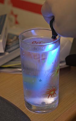
Glowing tonic water

...that tonic water glows under ultraviolet light.

(In this case, light from a UV Photon light.)

Modern tonic water (and bitter lemon, and a beverage made frae girders) only has a little bit of quinine in it. The original anti-malarial version of tonic water had far more of the stuff, which made it medicinally effective but also very bitter, such that adding a generous slug of gin to it could only make it taste better. Well, after you'd consumed enough doses, anyway.

Even a little quinine is more than enough for an impressive glow, though - quinine is often used in photochemistry as fluorescence standard, for this reason.

The ingredients label on the tonic I drink (usually straight; it's an acquired taste) lists quinine as "0.5%". If that's an accurate by-weight figure, then if you manage to put away a whole 1.25 litre bottle of the stuff, you've consumed something in the order of 6.25 grams of quinine. That's more than ten times the every-eight-hours medicinally effective dose of quinine dihydrochloride or sulfate (for IV or oral administration, respectively), which suggests to me that the listed concentration is a severe overstatement.

I did a nice before-and-after shot of a whole bottle of glowing tonic water for this old letters column. Wikipedia's version of the same thing is here.

This just in: Laws o' physics still unbroken

Whaddaya know - another compression scheme that violates rules of information theory has turned out to be a great big scam. The only part of this that surprises me is that I'd never previously heard of this Brent Kovar and his particular take on the broadband-down-a-thin-straw idea.

(For more shenanigans of this sort, check out the last letter in this column.)

Stupid Claim Not True: Film At 11

Here, the Bad Astronomer demolishes the ludicrous, but strangely popular, claim that our Sun is actually part of the Sagittarius Dwarf Elliptical Galaxy, not the Milky Way.

And so, uh, global warming is fake.

Or something.

(Ten points to anybody who posts a comment featuring an astrologer's point of view on this amazing Sagittarius revelation.)