The Inverse Law of Portrait Unusualness

I can't remember whether one of the old hands at News Interactive told me this during my brief stint of working for the Dark Lord Murdoch, or whether I came up with it myself. So I won't call it My Special Law Of Current-Events Publication Photographs, or whatever. But it does seem to apply most of the time. It is:

When you see a photo of a person in a newspaper or news magazine, the more outré the photo, the less interesting the person.

If the subject is at a sixty-degree dutch angle and leaning out over the balustrade of a purple spiral staircase amid a frozen shower of confetti, he will be the deputy manager of Accounts Receivable for Amalgamated Water-Based Bookbinding Mucilage, Incorporated, posing for a business-section feature about how AWBBM beat earnings estimates by 1.7%.

If the subject is just smiling at the camera from behind a low-maintenance beard, on the other hand, he's Steve Wozniak.

If the subject is only partially visible through the leaves of a potted palm and bathed in rainbow prismatic sunlight passing through a faceted lead-crystal recreation of Michelangelo's David, she was this month's top fundraiser for the church steeple maintenance drive.

If the subject is just standing there with her hand on a computer and a vague smile, though, she's Jeri Ellsworth.

Et cetera.

Application of this rule of thumb can get you through business and trade publications, in particular, a great deal faster, without missing a damn thing.

Layered lighting

Here's a little Photoshop trick that I occasionally find very handy.

Suppose you've got two or more photos of a given thing, none of which are properly lit. The right side is nicely illuminated in Photo One, but the left side is too dark. And the left side's OK in Photo Two, but in that one the right side is too dark.

You don't want to, or physically can't, go back and photograph the thing again.

Or perhaps the light there is never going to be any good, for reasons of geography, geometry or just the fact that you can't afford six flashes.

I ran into this just now when I was taking pictures of a ludicrously cheap network storage box I'll be writing a bit about shortly.

UPDATE: I've written the review now; it's here.

(In brief: It's a Noontec N5, and m'verygoodfriends at Aus PC Market are selling it for only $AU25 if you buy it along with a drive. And no, the drives are not overpriced to compensate. So all this thing is going to have to do to get a good review from me is, one, function, and, two, not send death threats to Barack Obama with my signature on them.)

One of my pictures of the shiny white box - which, of course, immediately tractor-beamed some cat fluff onto itself - looked like this:

First unsuitable image

Right side too dark.

Another looked like this:

Second unsuitable image

This time the front was too dark.

I could have reshot the image easily enough, but the Photoshop fix is faster. It's easy, too, as long as the images are pretty much identical except for the lighting. I'll talk about how to do it in Photoshop, but any imaging program with some equivalent of Photoshop's layers and blend modes can do it.

First, paste one image over the other, and set the opacity of the top image's layer to 50% or something, so you can see through it to line the two images up exactly.

Aligning images

(Lousiness of alignment exaggerated for illustrative purposes.)

You may not need to do this at all, but even when you're shooting with a tripod, it's common for successive images to be misaligned by a pixel or two. It may be impossible to perfectly align the images if they're off by some fraction of a pixel, or if perspective means they're off by different amounts in different locations. Just try to get the important parts of the overlapping image combination to look as sharp as possible.

Now, set the opacity of the top image back to 100%, and set its blend mode to "lighten".

Combined images

And you're done!

Layer-lightening animation

"Lighten" simply makes any pixel in the top layer opaque if, and only if, it's brighter than pixels in lower layers. So if you're combining images of the same object lit in different ways, you get a result that looks as if everything that illuminated the object in all of the images was illuminating it for just one photo.

I seldom set out to use this technique, but it's definitely not just a bad-photo-salvaging trick. If all you've got is one flash, for instance, you could take a string of pictures with the flash aimed and reflected and diffused in different ways, and then combine some or all of them to get the same effect as a bunch of simultaneous flashes, or a beauty-dish reflector, or a big studio flash with a large soft box, or J.J. Abrams and his Travelling Lens-Flare Circus.

You could also use this technique on video frames, sequential light-painting photos, and perhaps for astrophotography too. Any series of images you can shift and warp to pretty much line up with each other will work.

You could even use it to vanish dirt, dust or even insects on a thing you're photographing but can't properly clean. Take a shot, blow the dust around a bit, take another, combine with Lighten if the dust is darker than the object or with Darken if it's lighter.

(Even more complex blend-mode tricks involving lighting of different colours also suggest themselves.)

The Canon "Check Engine" light

"Error 99" strikes fear into the heart of people with Canon digital SLR cameras. It's a catch-all error which has a large number of possible causes, and my old EOS-20D...

Canon 20D with fisheye lens

...here depicted with a silly lens and...

Ridiculous camera rig

...here trying to retain some self-respect, started Error-99-ing from time to time a couple of years ago.

The error usually went away if I turned the camera off and on again, so I just lived with it for a while. Then it started happening all the damn time, every few pictures, so I scraped together some spare pennies and got myself an EOS-60D, which is very nice - shoots video, far better screen on the back, high-ISO improvements, et cetera.

Not long after the 60D (not to be confused with the EOS-D60, from eight years earlier, when $AU2000 was a low price for a DSLR) arrived, my 20D completely failed. Every attempt at a shot now produced the dreaded flashing "Err 99" on viewfinder and top display.

I always meant to try to get to the bottom of the error, though, and just now I got around to doing it.

There are many, many sites, like to pick one at random this one, that tell you Error 99 happens when the contacts on your lens and/or the matching contacts on the camera are dirty. Or perhaps it's your battery terminals that're dirty. This may be the case, and is at least easy to remedy with a pencil eraser or a dab of metal polish. But Error 99 really is a fall-through error that just means "something outside the other error codes listed,...

EOS-60D manual error table

...and magnificently clearly explained, in the manual".

In my case, Error 99 definitely wasn't happening because of dirty lens contacts, because the error still happened when there was no lens on the camera at all.

When I actually sat down to seriously diagnose the problem, it didn't take long. I found this excellent article at LensRentals.com, that talks about the many, many possible reasons for Error 99, and the many, many myths and legends concerning it. Some are very difficult for a home user to fix, like dead drive motors, or circuit-board stuff requiring surface-mount rework on extremely cramped electronics. If that was the problem, Canon could fix it for me, but only for about the price of a new(er) 20D on eBay, so I might as well toss the wretched thing and get a new one. Which is of course essentially what I've already done.

Aaaaanyway, I scanned the LensRentals Common Causes page, skipped the stuff mortals can't fix, and decided to see if a stuck shutter was the problem.

And lo, it was. (Which was good, because diagnosis of some Error 99s can be... time-consuming.)

To diagnose this, once you've established that the error happens without a lens, go to the Sensor Clean option in the camera menu and select it. (Modern DSLRs from Canon and some other manufacturers clean at least some dust off their sensors with a little ultrasonic shaker thing. In older cameras like the 20D, "Sensor Clean" just flips up the mirror and opens the shutter, so you can whip out the wire brush and pressure washer and clean the sensor yourself.)

With sensor-clean mode activated, just remove the lens if there's one on the camera, and look into the camera through the lens-mount ring. If you see the shiny sensor, the shutter is OK, or at least managed to open this time. If you see the matte-black shutter curtain, then there's your problem. And that's what I saw.

I poked the closed shutter curtain's segments around a little with a cotton bud - as with ordinary sensor cleaning, this made me feel like a gorilla trying to build a ship in a bottle, or possibly like a Caucasian who's too damn tall - and then removed the battery from the camera. With this problem, that's the only way to get a 20D, at least, back out of sensor-clean mode; just turning the camera off won't work, because the camera is still stuck at the "open the shutter" stage of the sensor-clean process.

Battery back in, camera back on, down went the mirror with a click, and now when I put a lens on it, I could take pictures again.

The shutter's clearly not fixed, though. It's just back to the state it was in when I didn't, quite, have to get a new camera yet. I shot a bunch of continuous-mode paparazzi pictures of nothing and got new Error 99s separated by ten or twenty images, but these ones were clearable by turning the camera off and on again. This camera, with a cheap zoom on it, is now a bit too bulky but otherwise suitable to be chucked in my backpack in place of the $40 eBay Kodak I used to have, until that got rained on the other week and became unhappy.

If the 20D gets back into the fully-wedged error-99 state when I'm out and about, I can just Sensor Clean it again and stick my finger in there to wiggle the shutter loose once more. I very much hope some of the $5000 Lens Brigade that hang around the scenic areas of my town get to see me do that, and go as pale as an audiophile watching someone fixing a $10,000 turntable with a club hammer.

You can get parted-out shutter modules for almost any model of DSLR for pretty reasonable prices; looking on eBay now I see 20D shutter assemblies for about $50 delivered. I actually have in my time managed to dismantle and re-mantle a digital camera and have it work afterwards, but that was just to clean out crud that'd mysteriously gotten into the lens assembly of a point-and-shoot; replacing a whole super-finicky module would not make for a pleasant afternoon.

There are a couple of eBay dealers, "camera-revivor" and "Pro Photo Repair", who as well as selling various camera bits will also each replace a 20D shutter for about $200. Again, this is stupid for an old DSLR that only costs about that much second hand, but it could make sense for someone with a high-end pro DSLR of similar age with the same problem.

Do any of you, gentle readers, know if there's some lubricant or other trick that may make my old 20D's shutter happier? You've got to be very careful doing anything like that to a DSLR, because oil on the sensor is Bad, and oil also catches dust and crud and sticks it to mechanical assemblies, which is Worse. Actually, many lubricants will all by themselves make a sticky shutter even stickier, owing to the tight tolerances, low mass and high speed of the mechanism.

To stick with the horrifying-shade-tree-mechanicking-of-precision-equipment motif I should probably just squirt some WD-40 in there. Actually, being serious for a moment, a tiny dab of graphite powder (which is, by the way, cheap and a very useful dry lubricant for tasks like, stereotypically, freeing up stiff locks) might work.

LensRentals say you might perhaps be able to slightly bend or otherwise modify a shutter curtain section to prevent it from binding, but they'd just send the camera in for a proper service.

What do you reckon?

"Small boy on bridge, this is Ghost Rider requesting a flyby..."

Some more of my friend Mark's FPV quadcopter, this time buzzing around Brisbane, where he lives.

(The funny-looking tower is the Skyneedle.)

Elastic athletes

A reader writes:

What the hell is going on in this "photo finish" picture?

Photo finish image

Two sprinters are perfectly tying for third place and creating new track and field rules, but what I mean is what's going on with runner #2's Sideshow Bob foot, and runner #1's Rob Liefeld foot. Runner #7 in the background looks pretty weird, too.

According to the New York Times, "the finish line cameras capture up to 3,000 frames per second". Do all of those frames look like this?!

TimT

The obvious way to implement a finish-line camera is, as the NYT say, to just run a movie camera at a huge number of frames per second.

This is not actually how most finish-line cameras work, though, primarily because of how shutters work.

A perfect camera shutter uncovers the film or sensor all at once, stays open for however long it's supposed to, then blocks the light, again all at once. You can try to implement something that works like this in electronics, or evade the problem by opening the shutter with the subject in darkness, briefly illuminating the subject with a high-speed flash, and then closing the shutter in darkness again. But that's no use for everyday photography or photo finishes, and making a physical object that works as an ideal shutter is pretty much impossible.

Instead, still and video shutters are implemented with "curtains", sliding plates, rotating discs, and various other things, none of which behave much like an ideal shutter when you need very brief exposure times, as is necessary if you need to see which runner, horse or car got over the line a hundredth of a second before the next one.

Most all-electronic cameras don't come anywhere near having an ideal shutter, either. Instead, they have a "rolling shutter" that scans across the frame, line by line or column by column, in a short but distinctly non-zero amount of time.

Rolling shutters aren't great for video, because things moving across the frame - because they and/or the camera are moving - will be in a different place as each new line or column of the frame is detected. This creates distinctive forms of distortion.

A rolling shutter will cause things that move through the frame relatively slowly to...

Rolling-shutter distortion
(source)

...display a distinctive slant.

Things moving very quickly, like aircraft propeller blades, look far more disturbing if the exposure time is short enough that they aren't just a blur:

Rolling-shutter propeller distortion
(source)

Seeing this in motion doesn't help:


(source)

OK, so here we have examples of distortion created because the "hole" that lets light into the camera is changing in size, shape and location over a long enough period of time that it visibly interacts with moving objects in the scene being photographed. This is bad for everyday photography, when you don't want things you're shooting to look weird.

Looking weird is acceptable in finish-line photos, though, as long as you know what the weirdness means. The picture can be as freaky and distorted as you like, as long as you can tell who got to the finishing line first. (Or, in the case of the picture you're asking about, who got there third. Third place was, in this race, good enough to qualify the runner who got it for a place in this year's US Olympic team.)

For this reason, most finish-line cameras aren't super-high-speed movie cameras, but instead a kind of slit camera. A slit camera has a line-shaped lens, which exposes the film or electronic sensor line by line or column by column, not unlike the way a rolling shutter works. The critical difference, though, is that a slit camera can keep on going indefinitely. You can keep collecting image data, or keep spooling film past the slit, for as long as you have memory or film. The shutter never closes as long as the film or memory lasts, so it's impossible to miss any action between the frames.

Flatbed scanners are a kind of slit camera, and with modification can in fact be used as one; anything that moves around while the scan's being made, though, will look distorted. Move an object in the oppposite direction of the scanner head's motion, and that object will look shorter than it really is. Move it in the same direction, and it'll look longer. (Move it at the exact same speed as the scanner head, and the scanner will just keep seeing the same bit of the object for the whole scan, making the object look like an endless stripe.)

OK, so now imagine taking a flatbed scanner sensor and setting it up vertically, looking across a racetrack at the finish line. Start a "scan", and it'll authoritatively tell you when every body-part of every runner makes it to the finish, by simply showing that part of that person before any part of anyone else. The speed of the scan should be set to roughly match the speed of the runners, so they look generally the right shape, but any part of any runner that stays stationary relative to the scan rate - a foot on the ground, for instance - will seem long. Any part that's moving forward relative to the scan rate - a hand or foot coming forward, for instance - will seem short. Even if you mess up the scan rate so everyone looks wide or narrow, whatever part of whatever runner shows up first in the scan is the first to cross the finish line.

Photo finish image

So let's look at this picture again. You can see that runner #4 got second place (whoever got first is off to the left somewhere), and #7 in the background is going to get fifth. Runner #2's foot got to the finish first, and because it was then planted on the ground it looks ridiculously elongated. Runner #1's left foot was moving forward as it crossed the line, and so it's shrunk.

Unfortunately for #2, the foot doesn't count. To win, your torso has to cross the line first. #2 has the first foot, #1 has the first hand and then knee, #2 has the first head... and then the foremost part of each of their torsos hits the line, so far as can be seen, at exactly the same time.

Here's some more about practical and artistic uses of photo-finish cameras; there's a Wikipedia article as well, of course. Slit-scan techniques have often been used to create strange visual effects, like Doctor Who intros and the trippy bit in 2001.


Psycho Science is a regular feature here. Ask me your science questions, and I'll answer them. Probably.

And then commenters will, I hope, correct at least the most obvious flaws in my answer.

Like being a rather small superhero

My friend Mark has an R/C quadcopter, with a First-Person View rig on it.

He came down from Queensland to visit us, and some other people, the other week.

And recorded some video, including some flying off Echo Point near where I live. Though with entirely too little buzzing of trees and tourists, or seeing how low he could go before the edge of the cliff tested the effectiveness of the copter's lost-signal configuration.

I am not in the Echo Point footage, because I was not there, because I am an idiot.

This sensor for sure, Rocky!

A reader writes:

Nokia 808

"Nokia announces 808 PureView ... 41-megapixel camera(!)"

HAHAHAHAHAHA, HAHA, HAHAHAHA, HAHAHAHAHAHAHAHA
HAHAHAHAHAHAHAHAHAHAHAHAHAHA

*choke* *gasp* *groan*

When I read that I immediately thought of your "enough already with the megapixels" page. I figured I'd send you the link so you can knock yourself out. :D

And now, back to frantic laughter...

Lucio

This thing may actually be less ridiculous than it looks.

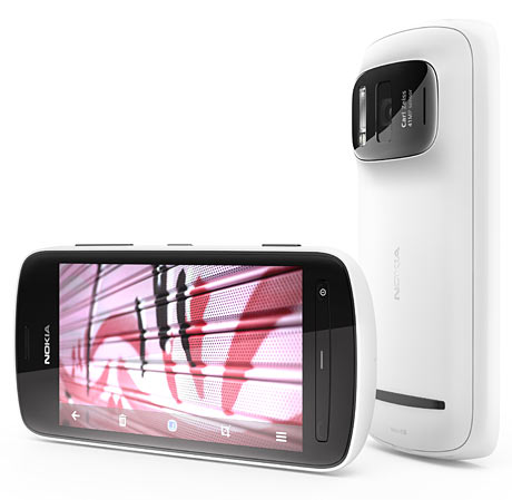
The sensor in the Nokia 808 is much larger than normal phone-cam sensors - much larger, in fact, than the sensors in almost all point-and-shoot compact digital cameras (not counting expensive oddballs like the new PowerShot G1 X).

In the inscrutable jargon of camera sensor sizes, the 808's sensor is "1/1.2 inches". This means a diagonal size of around 13 to 14 millimetres.

The "APS-C"-sized sensors in mainstream DSLRs have a diagonal around the 27 to 28mm range, and thus four times the area of the 808 sensor. "Full frame" DSLR sensors are way bigger again, but they're also way more expensive.

For comparison, the (surprisingly good) "1/3.2 inch" sensor in the iPhone 4S has a diagonal of less than six millimetres. Consumer point-and-shoots these days usually seem to have 1/2.3" sensors, giving a diagonal of less than eight millimetres. (I haven't researched this in detail, but the eight Canon consumer compacts and five cheap Nikons I just checked out were all 1/2.3.)

Fancier point-and-shoots, like Canon's PowerShot G12 and Nikon's Coolpix p7100, have somewhat larger sensors; those two both have 1/1.7", giving diagonals in the neighbourhood of nine to ten millimetres.

(The abovementioned PowerShot G1 X has a "1.5 inch" sensor, which after compensation for endowment-overstating jargon is a 23-point-something millimetre diagonal. That's very nearly mass-market-DSLR size, but you'd bleeding want it to be for a street price of $US799. You can get an entry-level DSLR with two unexciting but functional zoom lenses for that price. If you want something more compact, you can even get a mirrorless camera - a Nikon 1 J1, say - and a couple of lenses, for $US799.)

So the 808's 13-to-14-millimetre sensor isn't impressive by interchangeable-lens-camera standards, but it's pretty darn huge compared with compact cameras, and huger still by phone-cam standards. But it apparently has the same immense photosite density as the tiny sensors. So it really does have about 41 million photosites.

The 808 sensor is meant, however, to operate by "pixel binning" lots of adjacent photosites together, creating an image with a more sane resolution (apparently as little as three megapixels), but of higher quality than the same image from a tiny sensor with that same resolution.

Pixel binning is not a cheat like interpolating a low-res sensor's output up to a higher resolution. Done properly, binning really can make lots of super-small, noisy photosites into a lower number of bigger, less noisy ones.

I hope the 808 sensor actually does work better than it would if it were the same size but with bigger photosites in the first place. It seems a long darn way to go just to get a big megapixel number to impress the rubes, but stranger things have happened.

(The hyper-resolution also apparently lets the 808 use the much-maligned "digital zoom", a.k.a. just cropping out the middle of the image, without hurting image quality. Though, of course, the more you "zoom", the less pixel-binning the sensor can do. On the plus side, it's much easier to make a super-high-quality lens if it doesn't have to have any proper, "optical" zoom, and the minuscule lenses that phone-cams have to use need all the help they can get.)

The principal shortcoming of the small super-high-res sensors in phonecams and compact digicams is low-light performance. And "low light" can mean just "daytime with a heavy overcast", not even normal indoor night-time lighting.

The best solution to this problem is to avoid it in the first place by not being so damn crazy about megapixels, but that seems to be a commercial impossibility, largely thanks to my favourite people.

The next-best solution is to use a lens that lets in more light. But large-aperture lenses are much more expensive to make than small-aperture ones, and also tend to be unmanageably physically large for slimline-camera purposes. Oh, and the larger the aperture, the smaller the depth of field, which is bad news for snapshot cameras that often end up focussed on the end of a subject's nose.

Another low-light option is to use slow shutter speeds, but that'll make everything blurry unless your camera's on a tripod and the thing you're photographing is not moving.

Or you can wind up the sensitivity, and turn the photo into a noise-storm.

Or, if your subject is close enough, you can use the on-camera flash, which will iron everybody's face out flat.

(Approximately one person in the history of the world has managed to become a famous photographer by using direct flash all the time. Here's his often-NSFW photo-diary site. Half the world's photographers hate him.)

Some of the better compact digicams have a flash hotshoe on top. Bouncing the light from an add-on flash off the ceiling is a standard way to take good indoor photographs. A compact camera plus an add-on flash isn't really compact any more, though. It might be possible to work some kind of hinged flash into a phone-cam, but nobody's managed that yet.

My suspicions about the Nokia 808's low-light performance were increased by Nokia's three gigantic sample images (32Mb Zip archive)...

Nokia 808 sample image

Nokia 808 sample image

Nokia 808 sample image

...all of which look pretty fantastic, as demo pics always do.

If you look closely, the blue sky is noticeably noisy, shadow detail is a little bit noisy and a little bit watercolour-ed out by noise reduction, and at 100% magnification none of the demo shots are what you'd call razor sharp, especially around the edges of the image.

But the full-sized versions of these pictures are 33.6 and 38.4 megapixels. If you scale them down to the ten-to-twenty-megapixel resolution of a current DSLR, it'd be hard to tell the difference between the 808 shots and DSLR ones.

But not one of the demo pics was taken in low light.

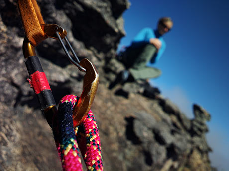
Nokia have, however, just added several more demo images on the 808 press-pictures page here. The new images include some lower-light shots. In every case, the lower the light, the lower the image resolution, as a result of that pixel-binning trick. But those lower-res images look good.

Nokia 808 sample image

I'm not sure what the light source is for this one - possibly a floodlight pointing upwards at the climber - but it's 33.6 megapixels, and looks pretty good, except for some watercolour-y noise reduction on the far rock wall. Presumably the light source is pretty strong.

Nokia 808 sample image

This seems to be an actual night-time shot, possibly taken with the on-camera flash but suspiciously nicely lit for that. It's a mere 5.3 megapixels, but not very noisy at all.

Nokia 808 sample image

This dusk shot is the same resolution but with a 4:3-aspect-ratio crop, taking it to only five megapixels. Noise is noticeable, but not obnoxious.

Nokia 808 sample image

Nokia 808 sample image

These two shots are both overcast daylight and are the low five-ish-megapixel size too. Their noise isn't a big deal either.

Nokia 808 sample image

And then there's this sunset picture, which sticks to the lower-light-equals-lower-resolution rule; it's back up at 33.6 megapixels, because it's exposed for the sunset, with everything else in silhouette.

Time, and independent review sites, will tell whether these pictures are representative of what the 808 can do. But it looks good, and plausible, so far.

Which is unusual, because odd sensor designs that're alleged to have great advantages do not have a good reputation.

Fuji's Super CCD did close to nothing in the first generation, and has developed to give modest, but oversold, increases in resolution and dynamic range.

Sony's "RGB+E" filter design didn't seem to do much of anything, and was used in two cameras and then quietly retired.

Foveon's X3 sensor genuinely does give colour resolution considerably higher than that from conventional Bayer-pattern sensors.

But, one, the human eye's colour resolution is lower than its brightness resolution (a fact that pretty much all lossy image and video formats, both analogue and digital, rely on), so higher colour resolution is something of a solution looking for a problem.

And, two, Foveon and Sigma (the only maker of consumer cameras that use the Foveon sensor, if you don't count the Polaroid x530, which was mysteriously recalled) insist on pretending that three colours times X megapixels per colour makes an X-megapixel Foveon sensor as good as am X-times-three-megapixel ordinary sensor. That claim has now been failing to pass the giggle test for ten years.

The Nokia 808 sensor, on the other hand, may actually have something to it. We've only got the manufacturer's handout pictures to go by so far, and any sufficiently advanced technology is indistinguishable from a rigged demo. But this actually could be a way out of the miserable march of the megapixels, without which we actually probably would have had, by now, cheap compact cameras that're good in low light.

Or it could turn out to just be more marketing mumbo-jumbo.

But I really hope it isn't.

Marble-ous photography

2012 Blue Marble picture

A reader writes:

I love NASA's new "Blue Marble" images. I was a kid in the early 70s when they took the first Blue Marble picture, but now the young whippersnappers all have their Google Earths and such and can all pretend to be looking out the window of a UFO whenever they want to. The magic hasn't died for me though, and now there are newer, better, brighter Blue Marbles! Three of them, from different directions!

Except in the "Western Hemisphere" one (which I found on Astronomy Picture of the Day), the USA is HUGE! It looks almost as big as the whole of Europe, Russia and China. The one that shows Australia and a lot of clouds makes it look as if Australia's the only land mass in one whole hemisphere. Africa's way too big in the "Eastern Hemisphere" one, too.

You've written about map projections before; is this something related to that? But that can't be it, there's no "projection" at all when the map of the globe is still a globe, right?

Ulricke

1972 Blue Marble picture

The original 1972 Blue Marble, above (the Wikipedia article has information about the 2012 version too), is what it looks like. It's a single photo, taken from a spacecraft - Apollo 17, to be exact. The famous photo was taken from a distance of about 45,000 kilometres, which is a bit higher than geostationary-orbit-distance, but well under a tenth of the distance to the moon.

(There are a lot more Apollo 17 images; they're archived here.)

The distance is important, because the earth is about 12,750 kilometres in diameter.

If you're looking at the earth from an altitude of 45,000 kilometres, you're only three and a half earth-diameters away from the surface of the planet. (If you're 45,000km from the centre of the planet, the nearest point on the planet is less than 39,000km, about three diameters, away. Keep this in mind when reading about orbits; it's not always clear whether a given distance indicates how far it is from the centre of one object to the centre of another, or the distance between objects' surfaces, or even the distance between an orbiting object and the barycentre of the orbital system.)

Shrink everything until the earth is the size of a tennis ball, and the original Blue Marble viewpoint would only be about 23.6cm (9.3 inches) away from the surface of the ball.

When you're looking at a sphere, you can never see a whole half of it at once. If you're very close to the sphere - an ant on the tennis ball - you can see a quite small circle around you, before the curvature of the sphere cuts off your view. (Actually, the fluff on the tennis ball would block your ant's-eye view much closer, but let's presume someone has shaved these balls.)

Go a bit higher up from the surface, and you can see a bigger circle. Higher, bigger, higher, bigger; eventually you're so far away that you can see 99.9999% of one half of the sphere, but you'll never quite make it to seeing a whole half.

(See also, the previously discussed optical geometry of eclipses. Shadows cast by spherical bodies are conical, and more or less blurred around the edges, depending on the size of the light source.)

If you're eight inches away from a tennis ball, you can see pretty close to a half of it, and if you're 45,000 kilometres from the earth, you can see pretty close to a half of the planet. Which is why, in the original Blue Marble, Africa looks pretty darn big, but not disproportionately so.

2012 Blue Marble picture

Now let's look at the 2012 Blue Marble.

(Note that there's also, confusingly, an unrelated other NASA thing called "Blue Marble Next Generation"; that's a series of composite pictures of the earth covering every month of 2004.)

The 2012 Blue Marble was stitched together from pictures taken over four orbits by the satellite Suomi NPP, previously known as "National Polar-orbiting Operational Environmental Satellite System Preparatory Project", which was just begging for that Daily Show acronym joke.

Suomi NPP is in a sun-synchronous orbit (which, just to keep things confusing, is a type of orbit that can only exist around a planet that is not quite spherical...), only 824 kilometres up. So Suomi NPP can't see very much of the globe at any one time. But if you're compositing pictures of a planet together, you can use your composite to render an image apparently taken from any altitude you like. Provided you've got enough patchwork photos to cover the whole planet, you just have to warp and stitch them until you've covered the whole sphere. Then, you can render that sphere however you like.

For the 2012 Blue Marble images, NASA chose to render the sphere from a much closer viewpoint than the 1972 image was taken from - they say the altitude is 7,918 miles (about 12,743 kilometers). That distance is, no doubt not accidentally, about the diameter of the planet - so the virtual "camera" for the new pictures is only one tennis-ball diameter away from the surface of the tennis ball it's "photographing".

As a result, Blue Marble 2012 shows rather less than half of the sphere. But this is not immediately apparent. At first glance, it just looks as if whatever you can see is bigger than it should be.

You can experiment with this in Google Earth or any other virtual globe, or of course with one of those actual physical globes that people used to use in the 1950s or during the Assyrian Empire or something before we had computers.

Anyway, look at the real or on-screen globe from a long distance and a given feature, like for instance Australia or North America, looks as if it takes up as much space as it ought to. Zoom in and whatever's in the middle of your view takes up proportionally more of the face of the planet, as things on the edges creep away over the horizon.

So the close viewpoint of the 2012 Blue Marbles doesn't give them away as "synthetic", stitched-together images. Something else does, though.

The feature image of the new Blue Marbles - the one that showed up on APOD, and countless other sites - is the one that shows the USA. I think NASA may not have chosen that one just for patriotic reasons, though. Rather, I think it may be because the America image is the only one of the three that doesn't have noticeable parallel pale stripes on the ocean.

The stripes - most visible in the Eastern Hemisphere image of Africa (4000-pixel-square version) - are from sunlight reflecting off the water, which the Suomi NPP satellite saw on each of its orbits, and which therefore show up multiple times in the composited image. A real observer sitting in the location of the virtual camera of the new Blue Marble would only see sun-reflection on one spot on the earth, if the appropriate spot was on the water.

The 1972 Blue Marble photo was taken with the sun pretty much behind the spacecraft, so it has this one reflective highlight in the middle of the image, off the coast of Mozambique.


Psycho Science is a regular feature here. Ask me your science questions, and I'll answer them. Probably.

And then commenters will, I hope, correct at least the most obvious flaws in my answer.