From the local fishwrap:
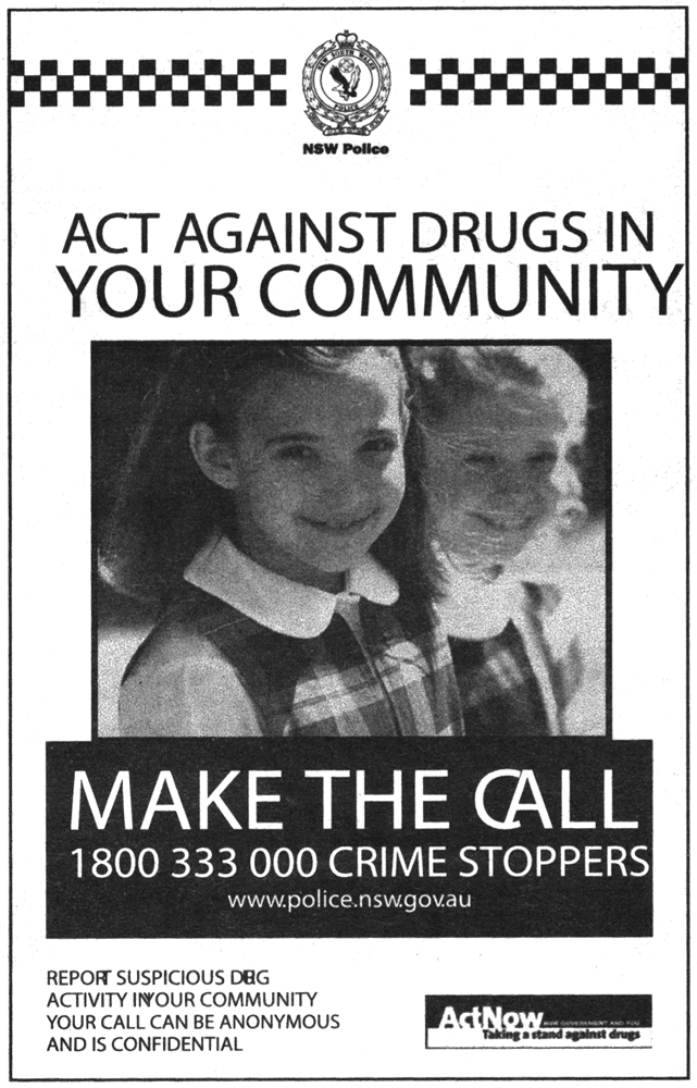
"The New South Wales Police: We Can't Even Get Kerning Right."
("Oh, man... I was sooooo high when I made that ad. Look, it's all screwed up, man! It's hilarious!"
I particularly like the new letter  . It should be the logo for a New York rave, or something.
I am also intrigued by the choice of the picture of two adorable little girls.
Are we to presume that little girls are being called upon to stop messing around with dolls and step up to do their part in the War on Some Drugs?
Perhaps dealers are using them as runners. Who'd suspect little girls in school uniform?
(You would, citizen, now that you've seen this ad!)
No, wait! Perhaps there's a way to turn little girls into drugs!
13 September 2008 at 4:44 pm
A classic example of keming.
13 September 2008 at 4:47 pm
Oh wait, that was your link. Probably should have checked that...
13 September 2008 at 6:27 pm
My guess is kerning and font substitution gone awry.
14 September 2008 at 2:43 am
Yeah, it looks to me like the designer used some fancy font (like NewSouthWalesSansExpanded), but the printing house didn't have it and Helvetica/Arial got substituted. Although there had to be a lot of people not paying any attention for this to actually make it into print.
14 September 2008 at 3:56 am
Dog activity? Hmmmm. I'lþe sure to keep an eye out. Hopefully they'll fж this little problem befσe they print another flier... Ћe fact that they can't even manage to get kerning right is sad.
14 September 2008 at 9:14 am
Little Sisters?
14 September 2008 at 2:19 pm
Wow. Lead designers are supposed to catch stuff like this. My guess is that someone packaged the project to send, yet failed to package the fonts with it. When opened at the press, whatever software they're using (InDesign or QuarkXPress, most likely) just auto-swapped for the default Arial font, and no one checked it for accuracy first.
This is why you use a PDF workflow. These things don't happen then. But it's also the fault of the press, for not double-checking that everything was kosher.
14 September 2008 at 8:41 pm
Mr Random Member, PDF isn't you're magic solution to things, its fairly easy to create a PDF without fonts embedded and on the system your creating it on its possible for that document to look find when you open it for your self.
15 September 2008 at 11:05 am
Forgive me for being a professional, then. But when dealing with professionals, there are supposed to be multiple eyes on every file to ensure that this stuff is caught. Not having those safeguards in place is bad for business at best, and foolish at worst - no one is going to take this piece of work seriously.
But if this was done in the secretary's spare time - or god forbid, if someone "Knew this kids who is real good with computers" - and proceeded to run a thousand copies off at Kinko's, well, your situation is entirely likely. Just goes to show you get what you pay for.
But the only way you could ever say that PDFs aren't the magic bullet is if you don't remember the bad old days of packaging raw documents for printing, and hoping your print company had the right fonts and the right software in the right version.
15 September 2008 at 12:52 pm
Every organisation that wants to tug at your heartstrings uses attractive, clean, well-dressed, (usually) white 6 year old girl models in their advertisement. Notorious offenders: the Salvos, World Vision. As a matter of principle I never support organisations that exploit 6 year olds.
16 September 2008 at 6:27 pm
I reckon I can do that NY with css
NY
(<p style="letter-spacing:-0.5em"> NY </p>)