When I'm looking at the Web site of a tradesman or small business, I actually take it as a good sign if the site looks like crap.
As long as it's got all the information you're looking for - often little more than basic "brochure" data - then the presence of dodgy table-based formatting, GIF animations, Comic Sans and so on just means that this particular house-painter, lawn-mower or solar-panel-installer probably hasn't spent much time or money on site design, with any luck because they were too busy doing their job.
There are, however, limits.
Allow me to present: Biomile Australia!
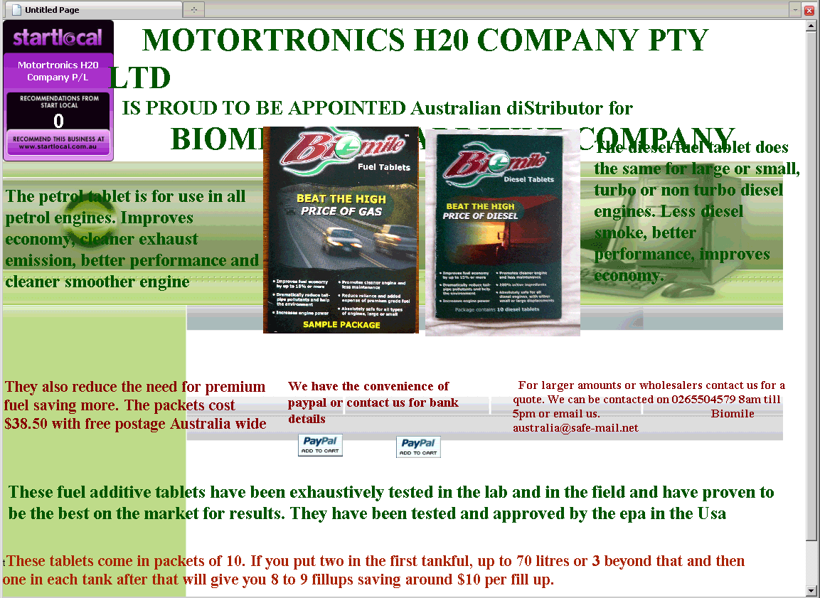
Or maybe "MOTORTRONICS H20 COMPANY PTY LTD", which is one of the bits of text peeking out from behind the two large images in the middle of the screen. If you've loaded the page, you've loaded the full-size images, which are just sized down with height="320" width="240" to fit on the home page. So I urge you to click on the second one and see it in all of its Web 0.2 magnificence.
Whoever the Biomile (not to be confused with BioPerformance!) people are, they're in the miracle-fuel-additive business, with - once your eyes stop bleeding and you manage to read the page - the usual claims about economy, emissions, power and so on. And, also according to the standard fuel-pill script, they say that Biomile pills "have been tested and approved by the epa in the Usa"! (I choose to pronounce that as "by the eep-ah in the ooh-sa".)
Well, the EPA does seem to know that Biomile exist, and the EPA actually has tested quite a lot of fuel-saving power-boosting gadgets and potions. But they have never found one that works. The EPA does not, in fact, endorse fuel-saving products at all.
(I was disappointed to see that Biomile pills also do not seem to have been tested by California Environmental Engineering.)
Never mind these quibbles, though. Let's get back to that awesome Web site!
I like to browse with the text size set a bit larger than the default, which somewhat breaks the formatting of some sites. I've also only got Firefox and Chrome here, plus Internet Explorer 6 hanging around for testing purposes. So I wasn't completely confident that the stunning broken-ness of the Biomile site wasn't, at least partly, my fault.
Compare and contrast the Australian Biomile site with the US one, for instance. The US site is a giant blob of Flash, but it looks quite good. And has, you know, page titles and stuff.
So I bounced biomileaustralia.com off a selection of different browsers on the immensely useful Browsershots.org.
The results are here, and they are not good.
(I did rather like Dillo's minimalist interpretation and Flock's even more minimalist one, though.)
Perhaps the Biomile Australia site is a devilishly cunning scheme to actively repel intelligent people, because they're nothing but trouble for the modern questionable-product entrepreneur.
Hmm. Probably not.
1 December 2009 at 5:14 am
You haven't seen the Biomile site in all its hideous glory unless you've seen it rendered in "Algerian" - a decorative, caps-only font!
A quick glance at the page's source reveals that, yes, the text *is* supposed to be in this font and it's not just some bizarre rendering glitch I'm seeing!
1 December 2009 at 8:07 am
Ah - an allcaps font would explain "epa" and "Usa", as well as "diStributor". Perhaps the dude in charge sometimes has his caps lock down and sometimes doesn't. Then he notices he left the S out of "distributor" when he typed it without caps lock, and when he fixes it he has caps lock down again, and because of the font he uses and most other people don't have, he can't see the difference.
2 December 2009 at 2:38 pm
Are they using bold on the font too, making the spaces in it look... bad? I'm a bit of a font nut and have a ton of them, so the site rendered correctly in "Algerian"... or at least some other whacky all-caps font that I thought would be good for something some day and have on my machine.
3 December 2009 at 6:08 am
The browsershots image links are broken.